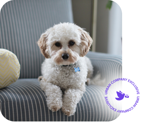
The new logo looks nice and quite simple. I love it.
– Nitin Srivastav (An Urban Company customer)
Straight communication is the smart one 🙂
– Arpit Verma (An Urban Company customer)
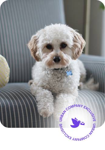
Much better! Clean & Simple.
– Radhika Batra (An Urban Company Customer)
It’s been an eventful year. What started from a one room office and the three founders, has gone on to become sprawling colorful offices with over two hundred enthusiastic souls sharing the dream. What started as a scribble on a napkin as a quick presentation of the logo to an investor, communicated one of the fastest growing start-ups in India.
Why is it then, that we changed our logo? When a few minutes of deliberation and a napkin as a tool for creating a logo will always make for a great story. And more importantly, when we can safely assume that a considerable number of people recognize us through our logo.
We changed because the start-up that is poised to join the billion-dollar club, changed. The dream of the three people in one room is mirrored by many now. From struggling to find our feet as just one of the services app, we have become THE services market place. Our vision has become lucid to not just us, but also to our potential customers – we seek to make your life simpler by delivering your service needs the way you want it, quality at a great price!
A logo is an eventual result of creation, elimination and deliberation. The story behind the series of these events is something we would like to share with you. As Mayank Dhawan, one of the minds behind the new logo, takes us through the stage of creation:
We floated a couple of options internally, each communicating what we want to be. Logos that spoke about connecting the right services to the people, the perfect fit to an urban life, but nothing really clicked. And then we decided to keep it simple. Because that’s what we are trying to do, make things simpler for people.
Simple doesn’t necessarily substantiate to dull. It takes a lot of creativity to communicate one’s brand through this approach. Rahul Beniwal, spearheading the logo redesigning, weighs in:
“The digital world is going flat. Trends in the design world are moving in the direction and some of the biggest brands exemplify that. This means that the design elements are simplified, as opposed to the heavily textured designs earlier. They help build a connect between the offline and the online world, where users like to see real world signals to navigate in the online world. We have always wanted people to seek the online world for their problems, rather than offline.”
It was only imperative why we moved to the new logo because in its entirety, it is reflective of the digital interface and how life is simpler with Urban Company. Suhail Vadgoakar, VP Brand, PR and Customer Experience, says:
“This is not a re-branding exercise. It is a transition with a logical business sense. Hence, we stuck to black and white because in essence that is what these colors also communicate – simplicity. We did have a palette of colors to pick from but we wanted to hold on to where we started from. We do dream big, but that does not translate to losing our humility. We always intend to better the lives of our customer.”
What do we have now? A logo that our customers like, a logo that is modern, yet simple and a logo that syncs with the digital trend. What about its marketability? Manu Gupt, VP Marketing, shares his insights:
“The current logo is extremely adaptable & if I may say, fairly timeless. It is not only optimized for digital displays but also for offline marketing collateral. The language of the logo is broader in the sense that it encompasses multiple communication – from quirky & fun ads to serious ones.”
Needless to say, we love our logo…do you?